Inspired by The Nester’s recent post, and my own love of paint, I wanted to share some of my very favorite paint colors used around my home. As we all know, monitor colors can be more than a bit off sometimes, so I always suggest putting a sample up on your walls before you commit to a whole gallon. Plus you get the added benefit of being able to look at your paint color in various light and times of day.
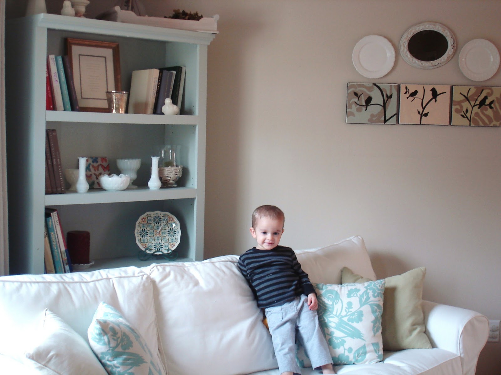
(who needs flowers and fake fruit as props when you have a cutie pie like this one running around? not me)
I think Sherwin Williams Comfort Gray is one of very favorite colors ever. Sorta blue, kinda gray, and a whole lotta perfect…it sets the bookshelf off from the wall perfectly.
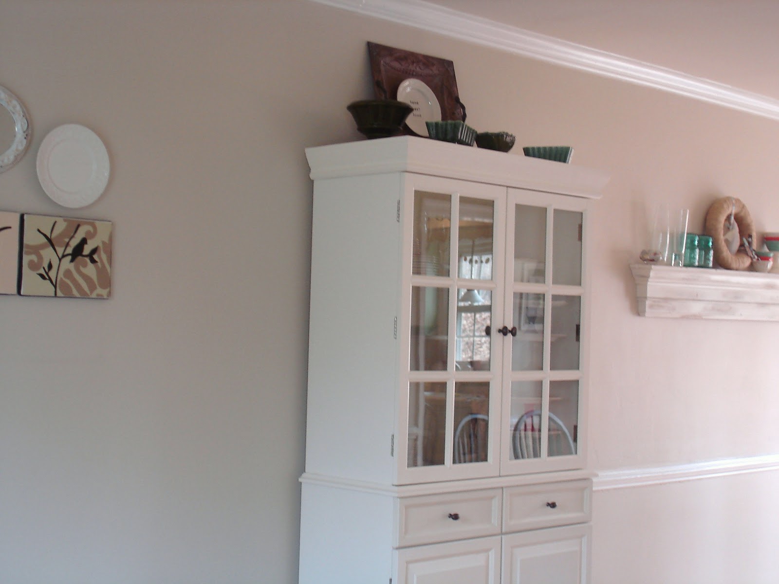
The wall, while we are on the topic, is Valspar’s Cincinnatian Hotel Hannaford from Lowe’s. It’s a perfect neutral…if I had to describe the color I’d call it a “light oatmeal” color…or maybe a “latte with lots of milk” color. Cuz that clears it up for you, I’m sure. Either way, it’s lovely.
Here’s another photo of the dining/living room wall…
Next up, did you all see my dresser rehab post earlier today?
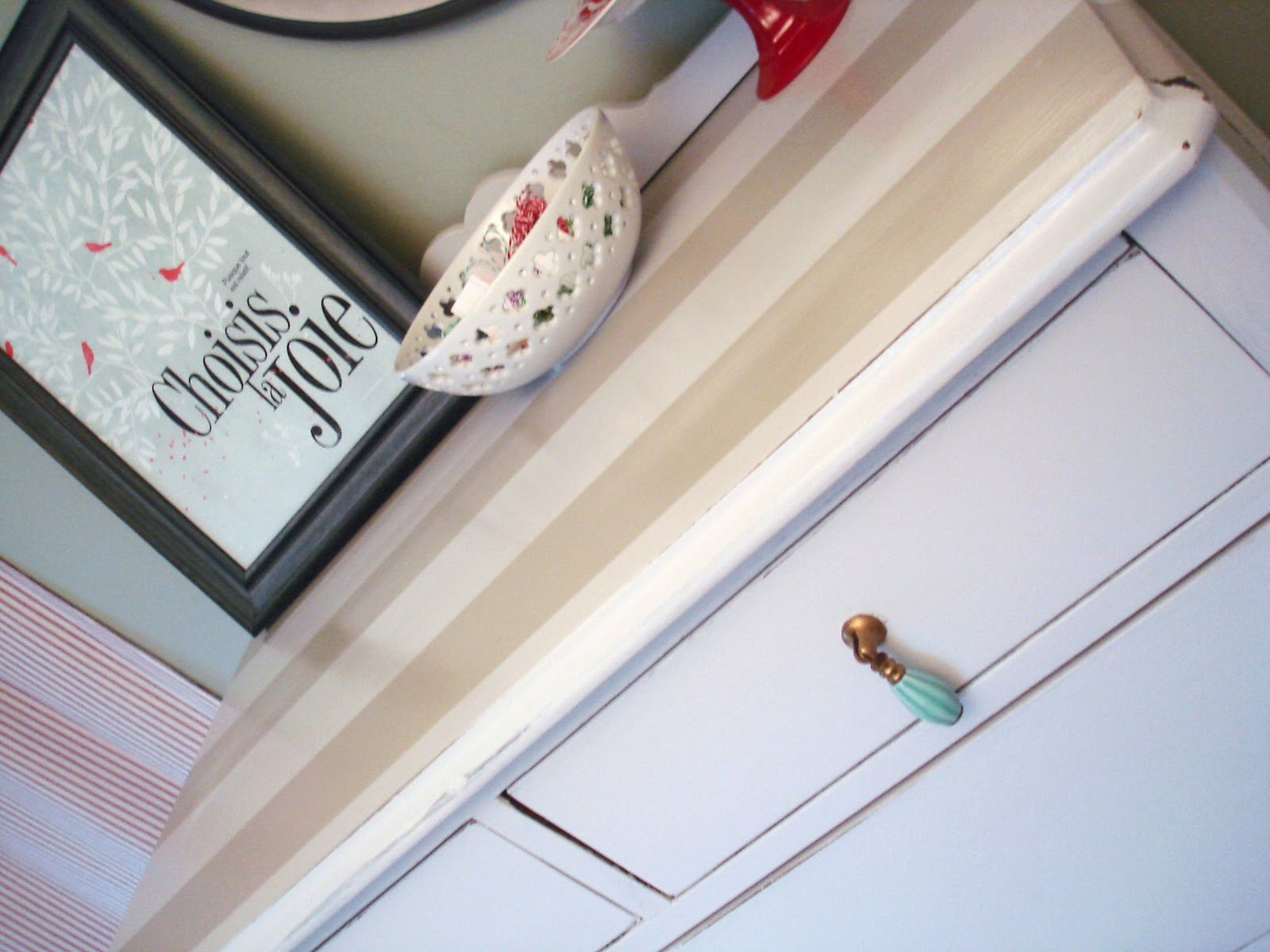
The light blueish-gray paint I used is Sherwin Williams Misty…you could mistaken it for a white, that is until you hold something bright white up against it. It’s neutral, it’s subtle, and fits in perfectly with the color scheme of my craft/guest room.
Do you have a favorite paint color? Please share! And don’t forget to check out Nesting Place for more inspiration!
Rene
Tuesday 1st of February 2011
Glad you shared this. I am in the market for just the right gray and here I sit armed with fan decks.
-Rene
Lisa
Tuesday 1st of February 2011
Love the blue knobs.
Cheers, Lisa x
Ali Richardson
Tuesday 1st of February 2011
Your home is absolutely gorgeous & that little guy is A-dorable)!